Case Study
Three decades of trust, one calm site.
Dr Nomsa Ntshingila
A calm, editorial site for a clinical psychologist and executive coach, pairing warm portrait photography with clear service pages for therapy, coaching, and organizational consulting.
Context
Context
Dr Nomsa Ntshingila has practiced as a clinical psychologist and executive coach for nearly three decades, working across individual therapy, executive coaching, and organizational consulting for teams navigating change. Her practice had grown almost entirely through referral: colleagues, former clients, and organizations who had worked with her directly and trusted her enough to recommend her by name.
That kind of trust is hard to build and easy to undersell online. Her existing website was the first thing a prospective client encountered before ever speaking with her, and for many visitors it was the only signal they had to judge the practice by. It needed to do the work that nearly thirty years of reputation had already done offline: reassure a stranger, in seconds, that they were in capable hands.
The Problem
The Problem
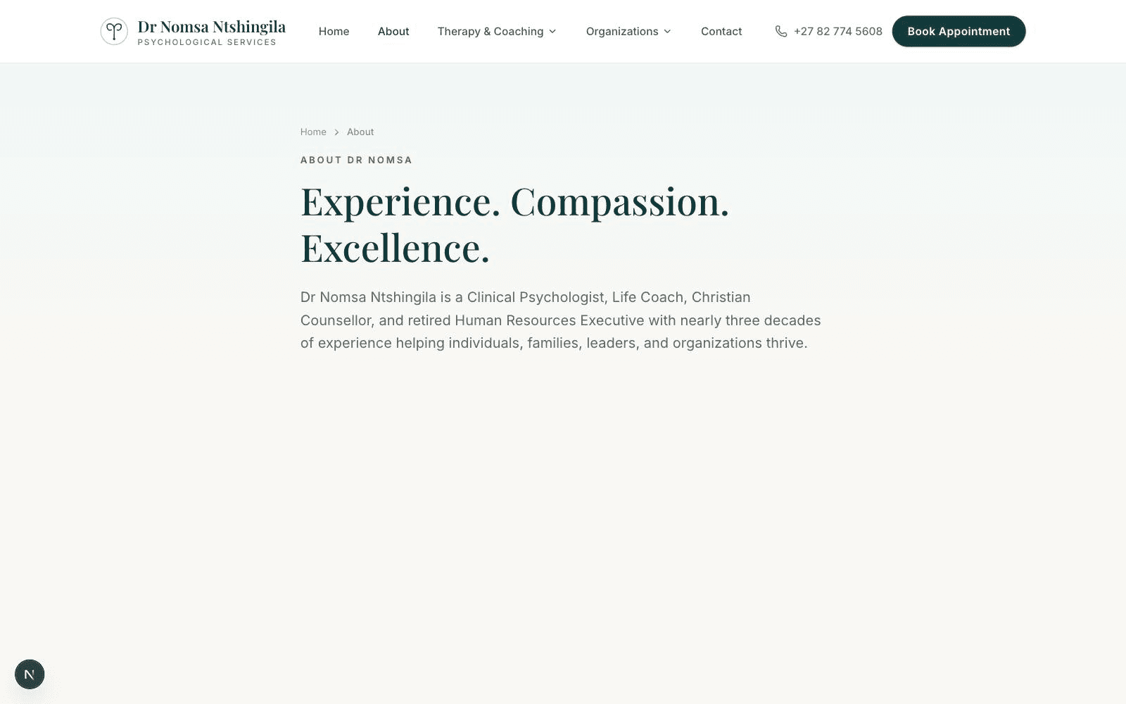
The existing site leaned on the same visual language used across the wellness industry: soft stock photography, generic rounded icons, and copy so broad it could have described almost any practitioner in the field. Nothing on the page reflected who Dr Nomsa actually was, what she had seen in nearly three decades of practice, or why her approach differed from a generalist directory listing.
The bigger structural problem was that therapy, executive coaching, and organizational consulting were folded into a single undifferentiated page. Someone arriving in crisis looking for individual therapy saw the exact same message as an HR director researching organizational consulting, and neither visitor could tell within the first few seconds whether the practice was actually right for their specific need.
Strategy
Strategy
We started by separating the three audiences the practice genuinely serves, since each arrives with a different vocabulary, a different level of urgency, and a different threshold for trust. An individual searching for therapy needs warmth and reassurance above all else. An executive researching coaching wants evidence of results. An organization scoping consulting work wants to understand process and outcomes before anyone picks up the phone.
The positioning we landed on across all three was calm authority: let nearly three decades of experience speak for itself through specificity and restraint, rather than through wellness-industry cliché.
Wireframes
Wireframes
Early wireframes mapped a homepage built to route each visitor toward the right service within seconds, rather than presenting one generic list. From there, three dedicated service pages were sketched so each could stand entirely on its own: its own headline, its own explanation of what working together actually looks like, and its own path to getting in touch.
We deliberately kept the layout spare. One clear message per section, generous whitespace instead of dense blocks of reassurance, and a navigation that never disappears, so a visitor never loses track of how to reach out.
Branding
Branding
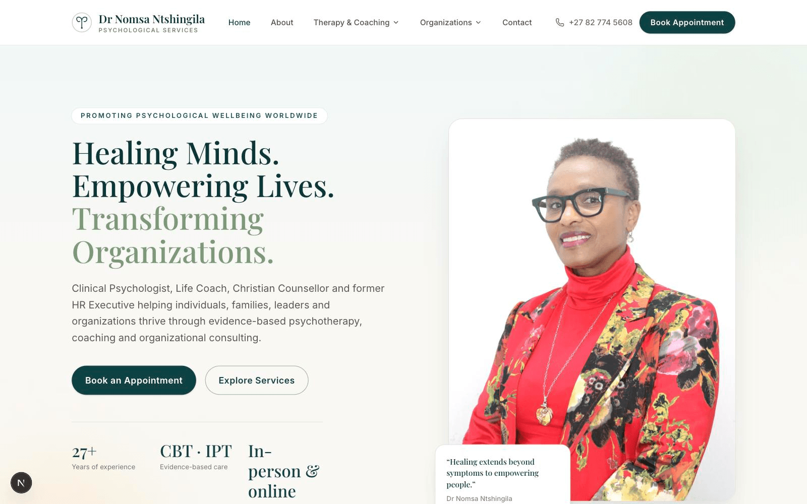
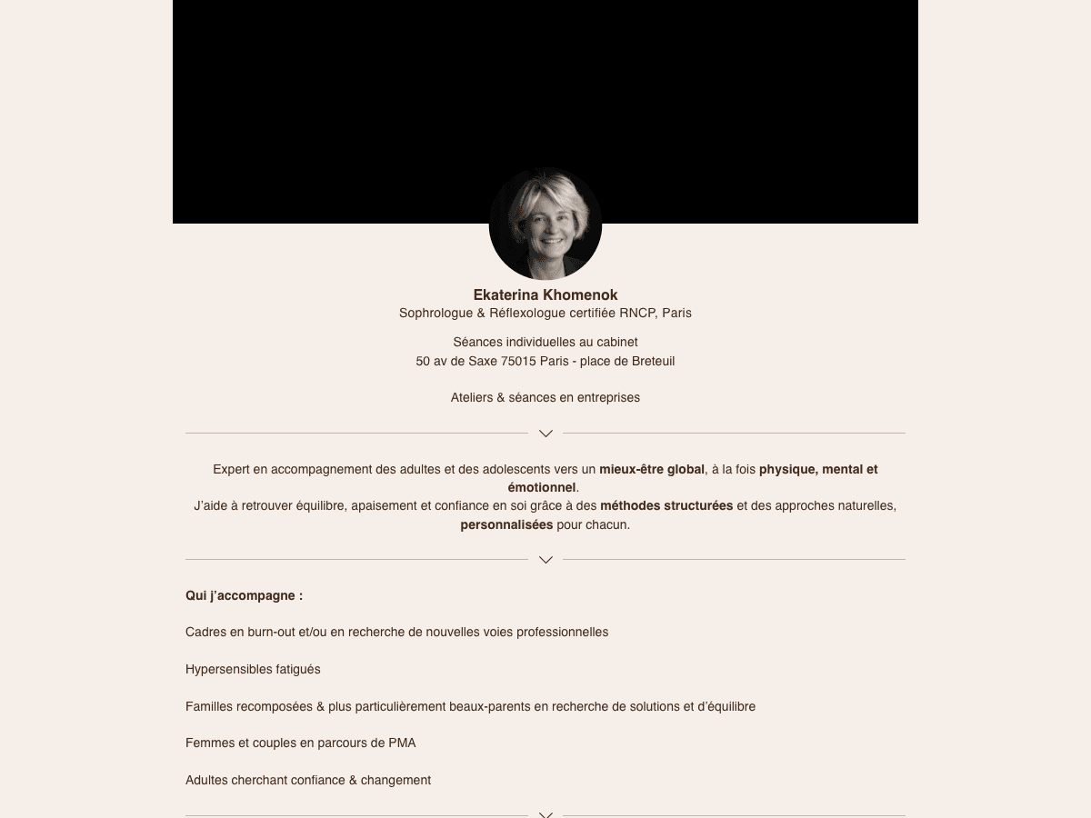
The visual identity moves away from soft pastels and generic wellness iconography toward a warmer, more editorial palette grounded in real portrait photography of Dr Nomsa herself, taken specifically for the new site. Typography carries most of the emotional weight: an editorial serif for headlines paired with a plain, highly legible sans-serif for body copy.
Color was pulled back deliberately. Instead of the pale blues and greens common across the wellness category, the palette leans on warm neutrals, letting the portrait photography and the writing carry the emotional register instead of relying on color to signal calm.
Development
Development
The site was built as a fast, accessible static site with dedicated, indexable pages for therapy, executive coaching, and organizational consulting, each carrying its own metadata and structured data, so the right page can be found directly through search rather than funneling every visitor through the homepage first.
Enquiry forms route by service, meaning the first message a prospective client sends already tells Dr Nomsa which of the three practices they're reaching out for. Page load times were kept deliberately fast even on mobile connections, since a slow site is its own kind of unreassuring first impression.
Results
Results
The site now gives each of the three audiences a clear, dedicated path instead of one page attempting to speak to all three at once. A visitor can tell within seconds whether they're in the right place, read language written specifically for their situation, and reach a clear next step without hunting for it.
The warm portrait photography and editorial tone give a nearly thirty year practice a web presence that finally matches the trust it has already earned through referrals alone.
FAQ
FAQ
About five weeks from the first discovery conversation to launch. Most of that time went into structuring the three service areas correctly and directing the portrait photography session.
Each audience arrives with a different vocabulary, a different level of urgency, and different questions they need answered before they'll reach out. Separate pages let the site speak directly to each one instead of diluting the message.
Yes. We directed a portrait photography session with Dr Nomsa specifically for the new site, replacing the generic stock imagery the previous site relied on.
The homepage is built to help a visitor self-identify quickly, with clear, distinct descriptions of who each service is for, so even an undecided visitor can find the right starting point within a few seconds.
Have a project like this in mind?
Tell us about your project and timeline. We reply within one business day.