Case Study
A studio with 200+ projects, finally presented like one.
Аркада
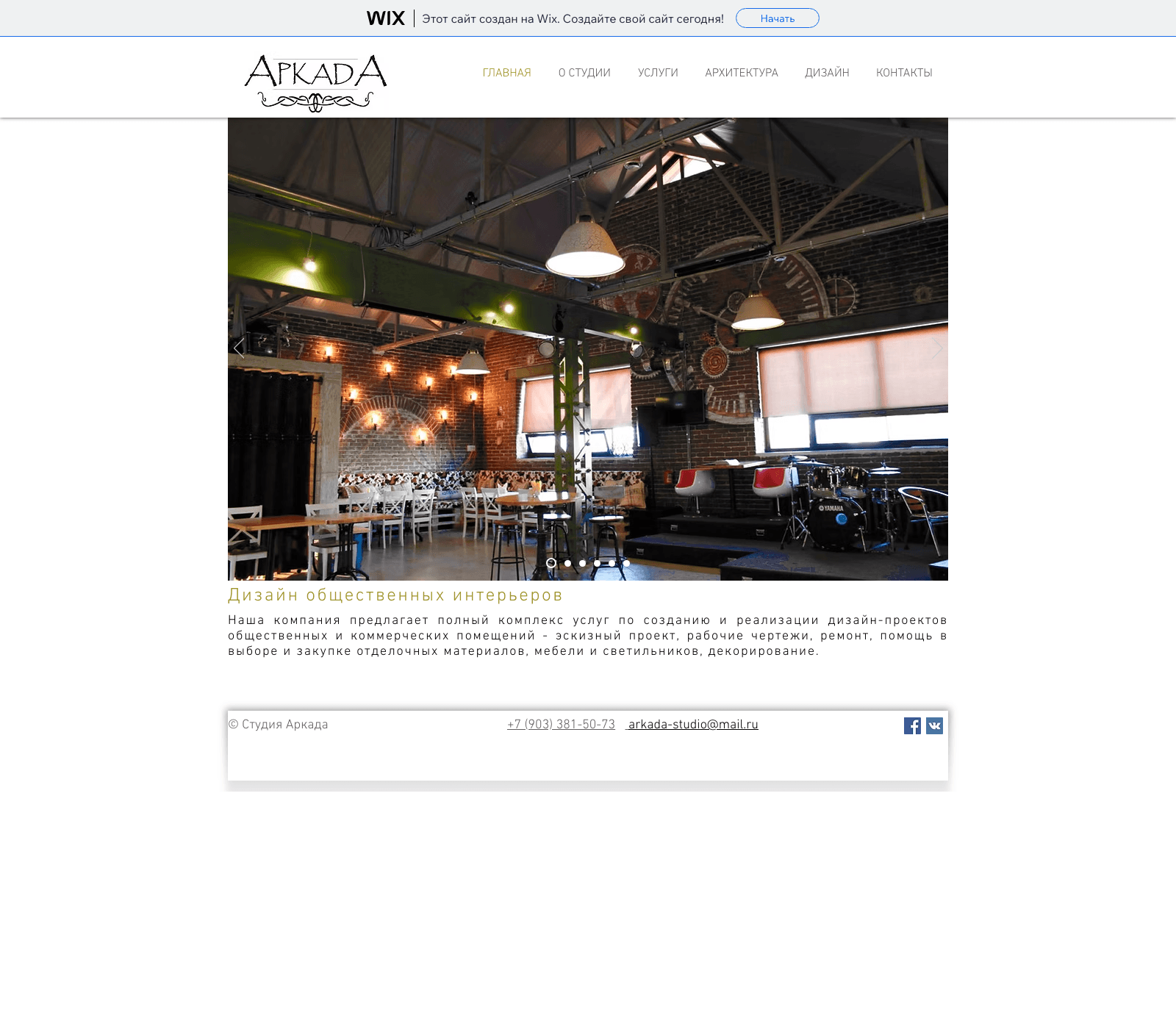
A ground-up redesign for an architecture and interior design studio in Saratov and Engels, Russia, replacing a free Wix subdomain with mismatched contact links and zero lead capture with a real site built around 200+ real projects.
Context
Context
Аркада is an architecture and interior design studio founded in 2007, working across Engels and Saratov in southern Russia, with a six-service catalog spanning private and commercial interiors, architectural design, custom furniture, construction supervision, and project procurement. Over eighteen years, the studio has completed more than 200 projects, led by a small team that includes a director, a chief project architect, and a project manager.
That kind of track record is exactly what a prospective client wants to see before committing to a home renovation or a new build, one of the highest-consideration purchases most people make. But the studio's entire digital presence lived on a free Wix subdomain, a URL that undercut the credibility of an 18-year, 200-project practice before a visitor read a single word.
The Problem
The Problem
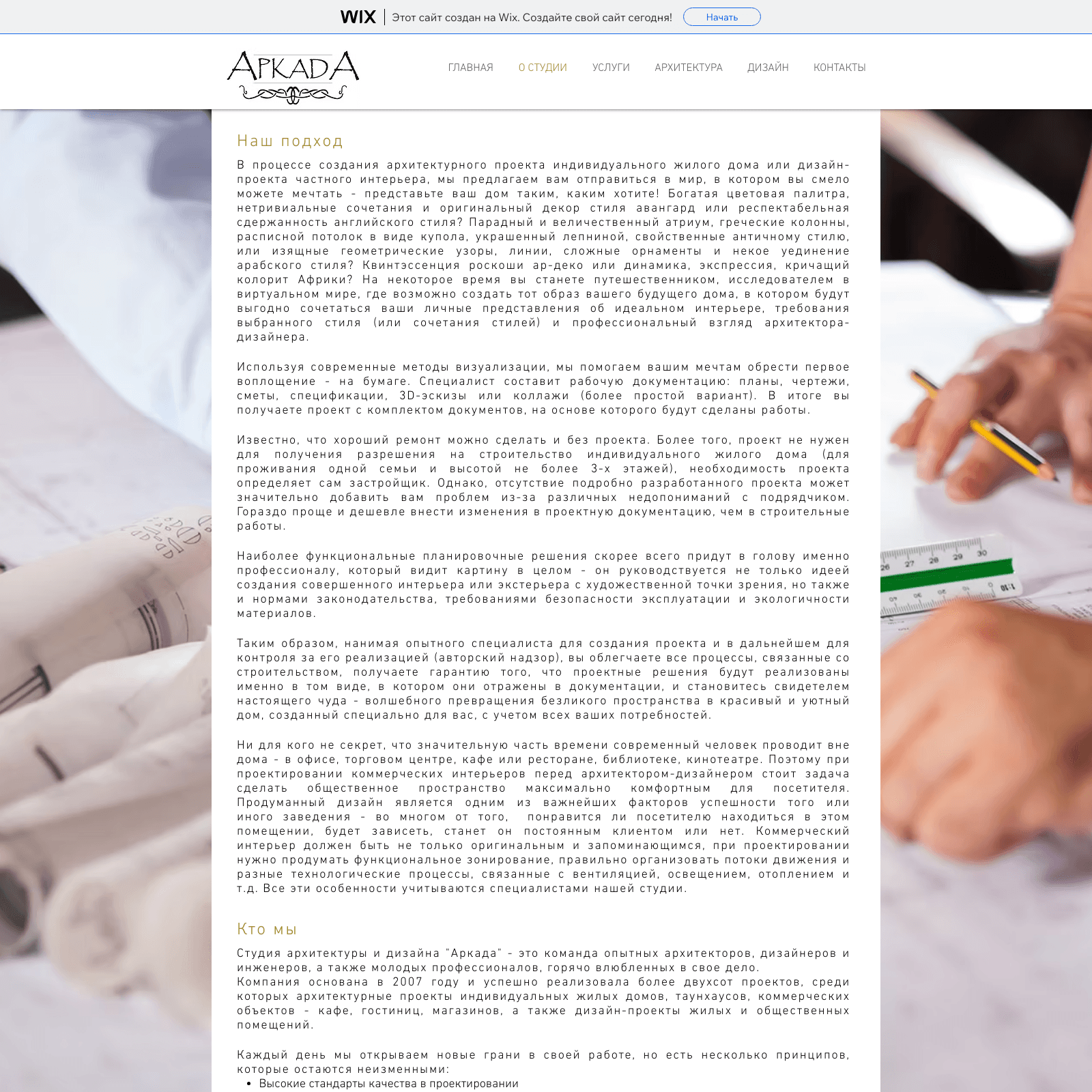
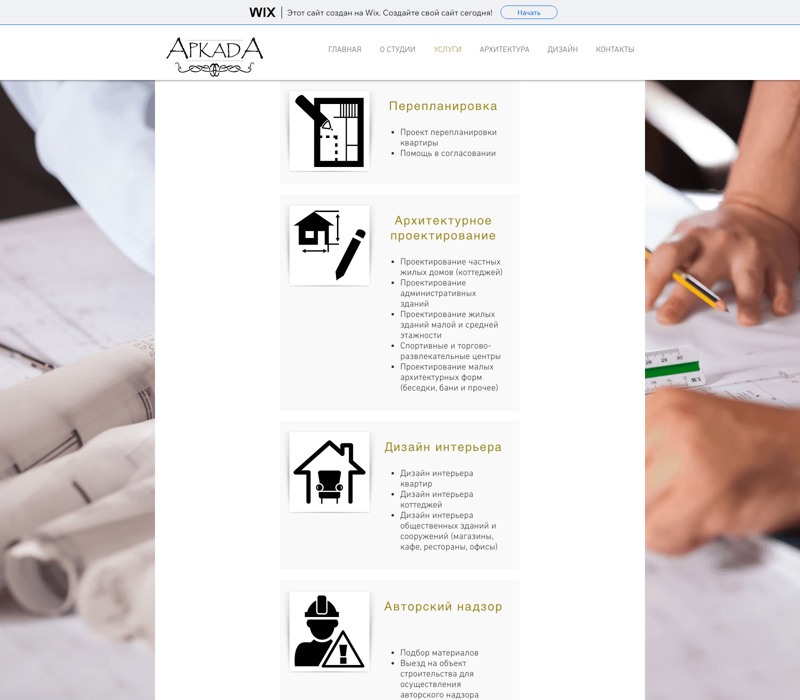
A full technical audit of the existing site surfaced problems well beyond outdated design. The header's phone number displayed one digit sequence but its call link dialed a completely different number in a different city's area code. The header email displayed one address but its link opened a different one. The site's meta description and social-share tags still referenced a Moscow office and phone number that appeared nowhere in the actual page content, a leftover from a location the studio no longer operates from.
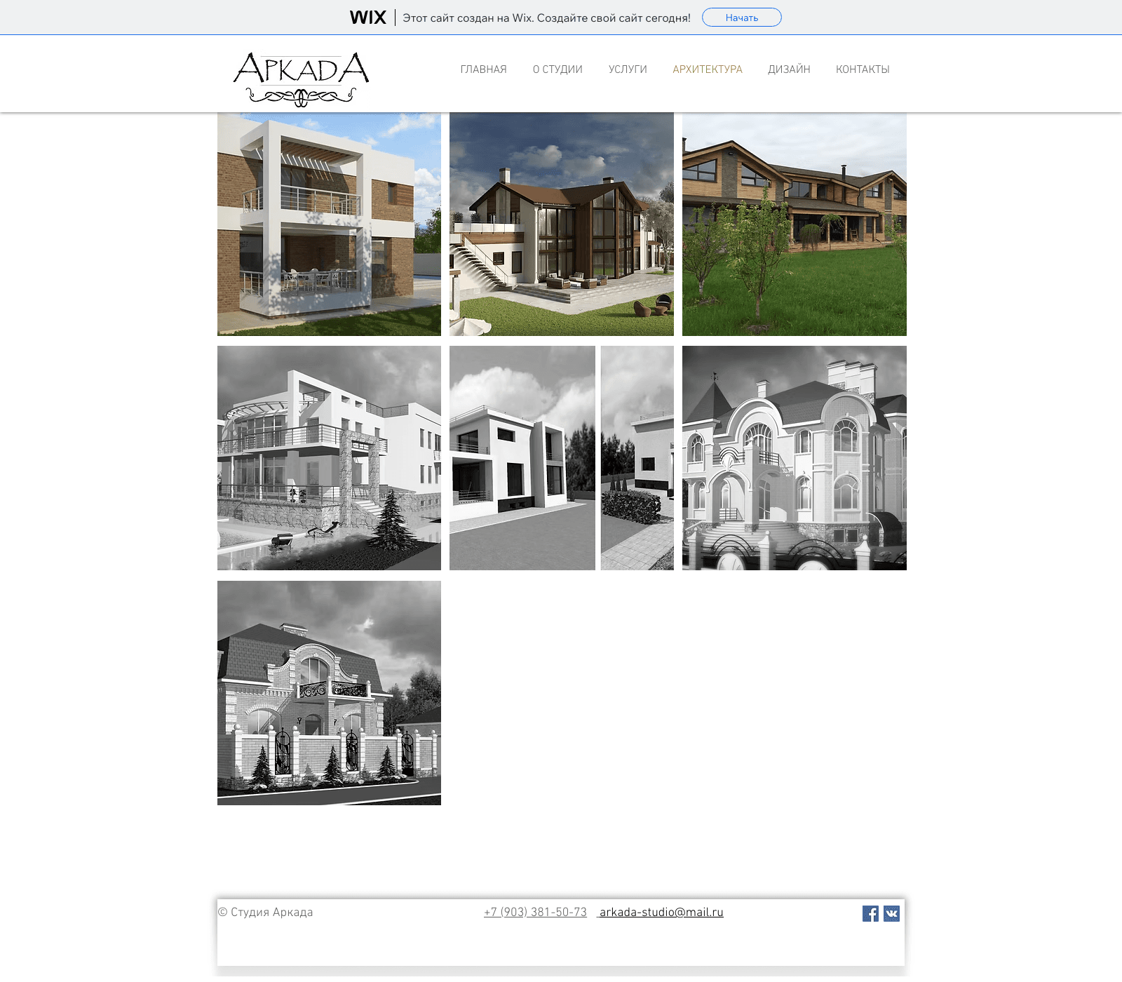
Most seriously: the site had zero form elements and zero input fields anywhere, including the contact page. The only way to reach the studio was a phone call to a number that might not even be correct, or an email to an address that might not be monitored. The 22-project portfolio, the studio's strongest asset, was presented as bare image carousels with slide counters like "1/16" as their only caption: no project names, locations, or story.
Strategy
Strategy
The studio had flagged four service lines as genuine growth priorities: private interior design, commercial interiors, architectural design, and custom furniture. The strategy started by sequencing fixes correctly: broken contact information and a missing lead form are conversion-killing defects that no amount of visual polish can compensate for, so those were treated as prerequisites, not nice-to-haves, before any redesign work began.
From there, the homepage needed a job beyond listing six services: a clear positioning statement, curated proof from the 200-project history, and a real path to contact. The portfolio needed to become a set of case studies instead of a gallery, since a decision this significant deserves more than a slideshow. And the studio's genuine differentiators, including that the chief architect previously served as chief municipal architect for both Engels and Saratov, needed a place to actually be seen.
Wireframes
Wireframes
Wireframes started with the homepage's job: state clearly what Аркада does, for whom, and why 18 years and 200 projects matters, all above the fold, followed immediately by a trust strip (founding year, project count, team size) rather than burying those facts on a separate About page.
Below that, a curated selection of flagship projects, not the full 22-project archive, each with a name, category, and location, linking into individual project pages. The full portfolio was planned as its own filterable destination, organized by private homes, residential interiors, and commercial interiors, rather than one undifferentiated grid. The contact page was wireframed around a real qualifying form: name, phone, project type, location, area, and timeline, positioned alongside correct, single-source contact information.
Branding
Branding
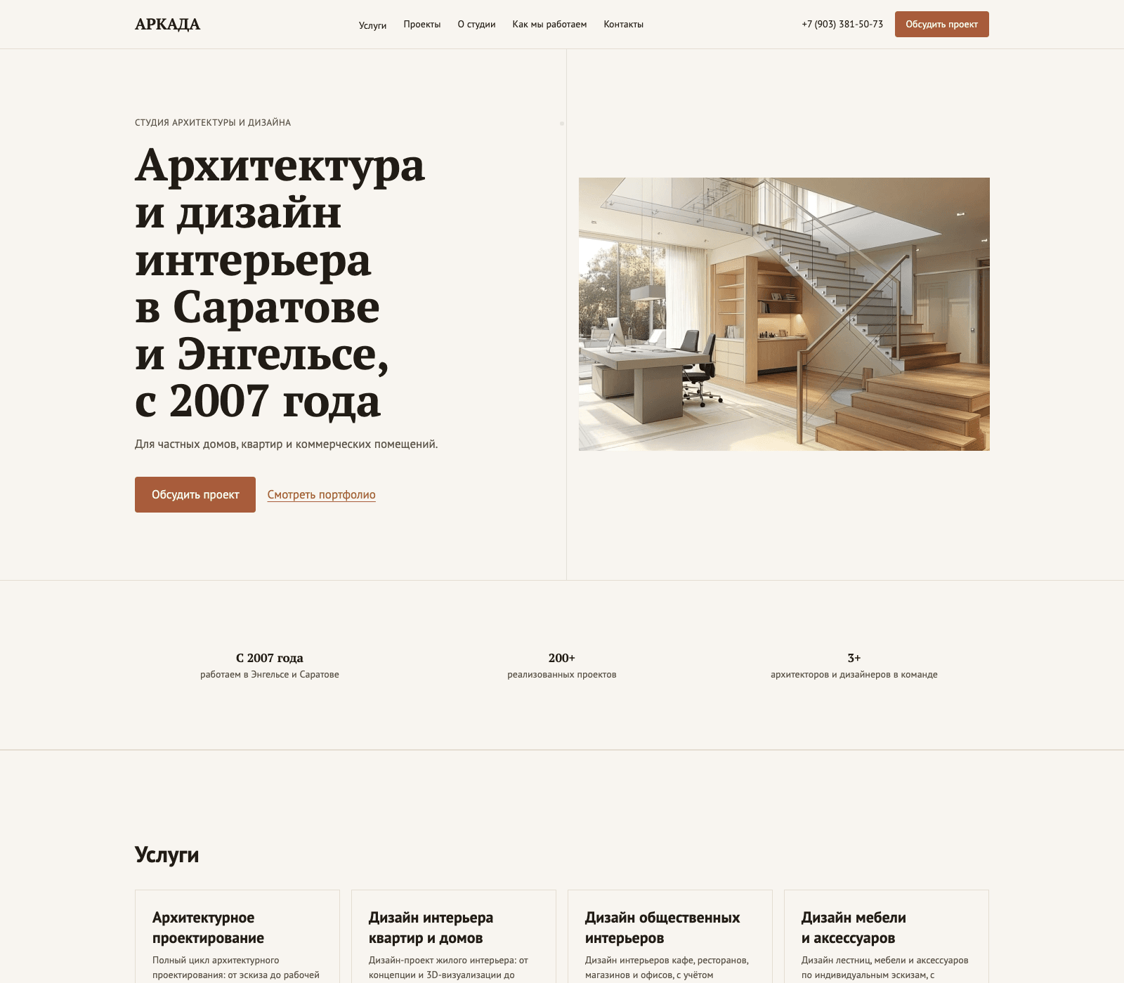
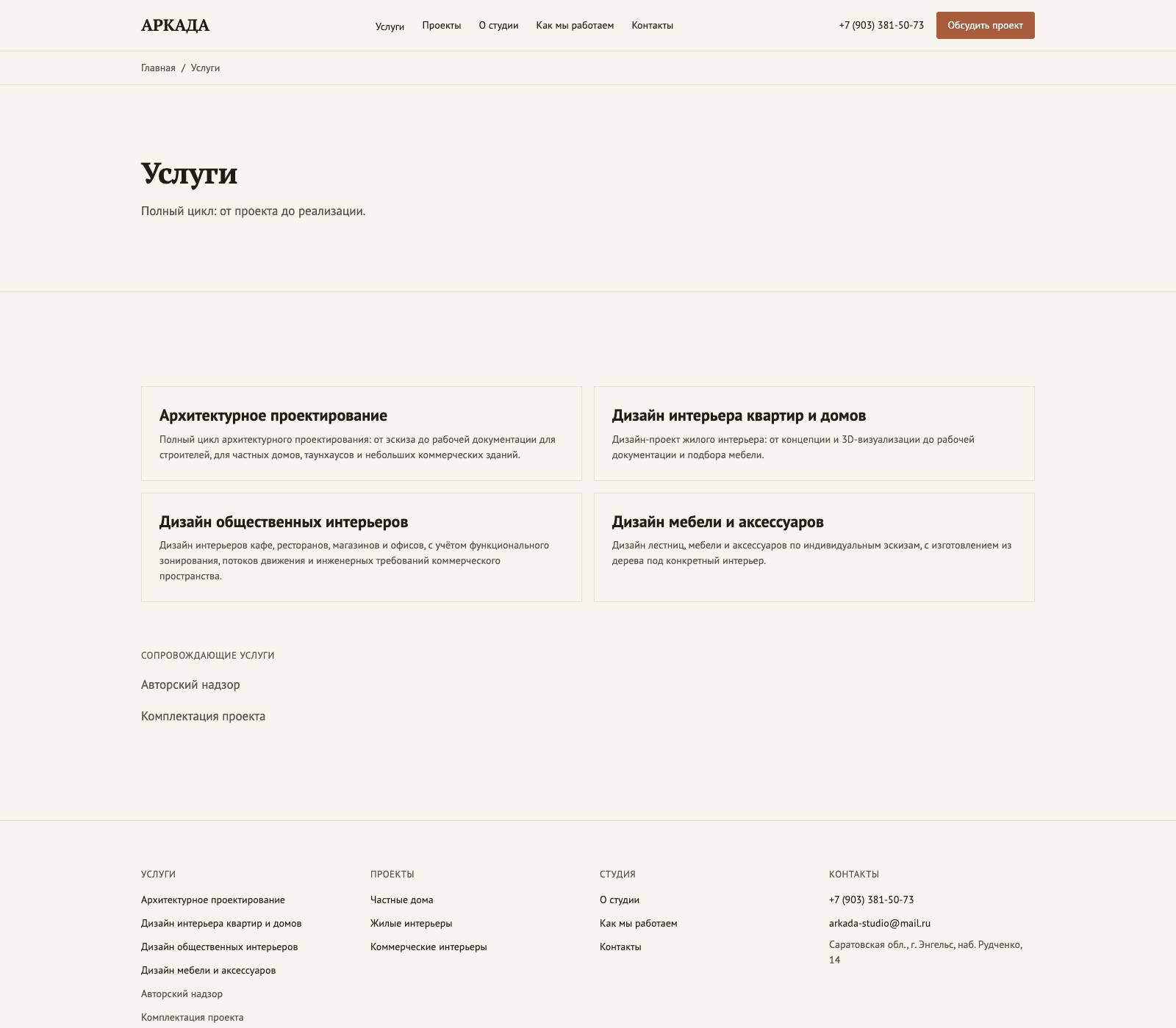
The existing hand-lettered "АРКАДА" logo suggested a considered, slightly classical identity that nothing else on the old site reinforced. The new visual system extends that intent: a warm, editorial palette pulled from the studio's own portfolio photography, a confident serif for headlines, and generous whitespace that lets 200 real projects speak for themselves instead of competing with decorative template chrome.
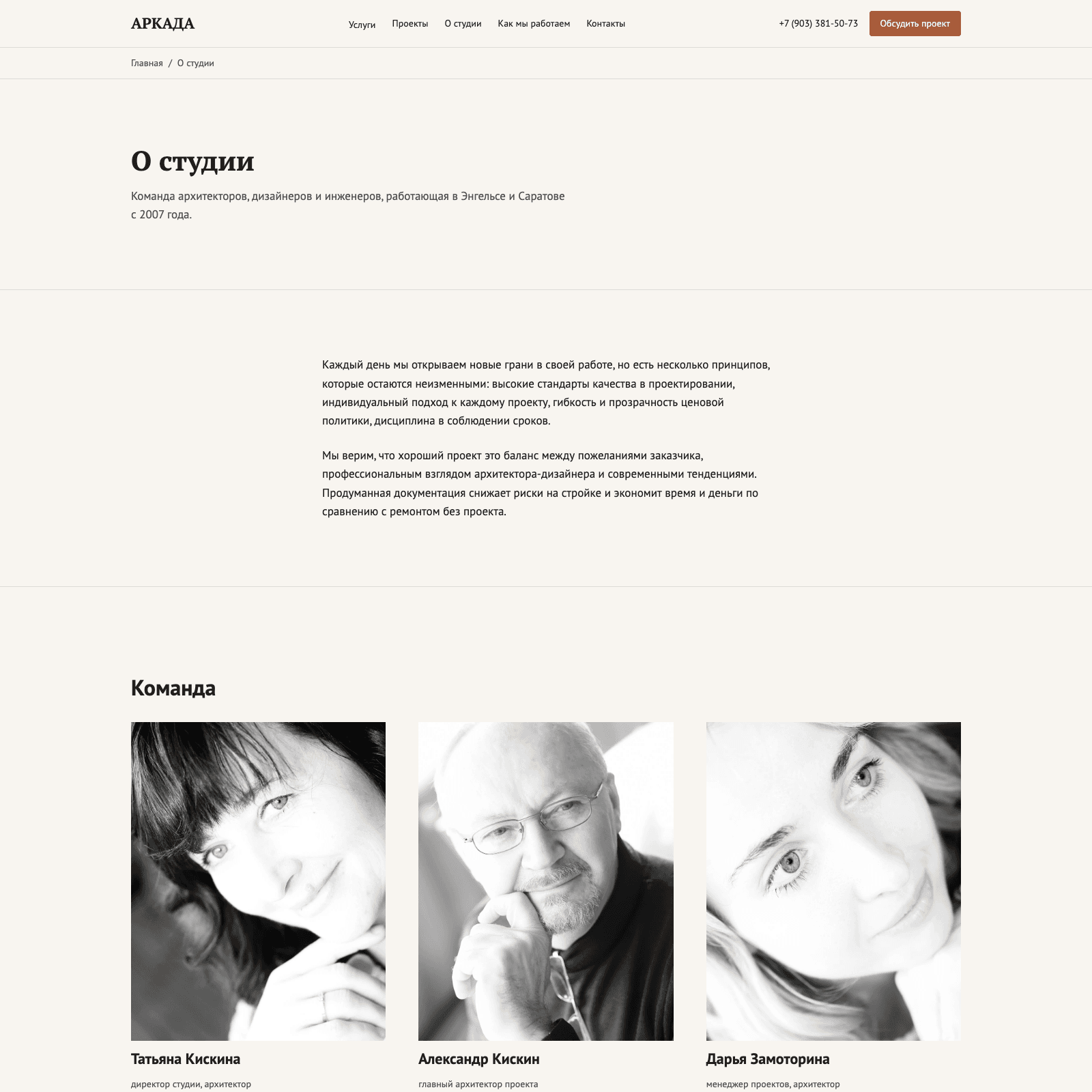
Real team portraits replaced the complete absence of any human presence on the old site. Showing the director, chief architect, and project manager by name and face does real work for a business where the buying decision hinges on trusting the specific people behind it.
Development
Development
The site was rebuilt entirely off Wix, removing the free-subdomain constraint, the platform ad banner, and the broken sitemap that came with it. Every contact detail, phone, email, and address, was audited and made consistent across the header, footer, contact page, and metadata, closing the exact mismatch that was misdirecting leads.
A real quote-request form was built with fields designed to qualify a lead before the first call: project type, location, approximate area, and timeline. The portfolio was rebuilt as filterable, categorized case studies with proper project pages instead of bare carousels. The site is fully in Russian, structured for local search in Saratov and Engels specifically, with local business schema carrying the studio's correct, current contact information.
Results
Results
The studio now has a digital presence that actually matches an 18-year, 200-project practice: correct contact information everywhere, a working lead-capture form where none existed before, and a homepage that states its case in the first screen instead of six slides of unexplained service names.
The portfolio has gone from 22 uncaptioned image carousels to a categorized, filterable set of real case studies, each with a name, a location, and a category, giving a prospective client the story that a decision of this size actually requires. And the studio's most distinctive credibility signal, a chief architect who once held the municipal chief architect role for both cities the studio serves, finally has a place on the site where a visitor will actually see it.
FAQ
FAQ
The phone number and email displayed in the header linked to entirely different contact details than what was shown, and the site had zero contact forms anywhere. Those were fixed first, before any visual work began.
The studio already had 22 real projects; the problem was that none of them had a name, location, or story. The rebuild turned an image gallery into a categorized set of case studies using material the studio already had.
Yes. A free Wix subdomain blocked a proper sitemap, added a platform ad banner directly above the studio's own logo, and capped how far local SEO could go for a studio that specifically serves Saratov and Engels.
The chief architect's background as former chief municipal architect for both Engels and Saratov, previously absent from the site, is now a featured credibility signal, alongside real team photos and the studio's 200-project, 18-year track record.
Have a project like this in mind?
Tell us about your project and timeline. We reply within one business day.